Visual Condition
Results
Table 3-1 shows the visual assessment results for the 2023 survey. In all instances, the panel marks represent the average of five individual assessments.
| Site | Type | Stress | Agg. | Panel | Suffix |
|---|---|---|---|---|---|
| IP1 | TS2010 | M | 10 | G | Jo |
| IP2 | TS2010 | M | 10 | G | N/A |
| IP3 | TS2010 | M | 10 | E | N/A |
| IP4 | TS2010 | M | 10 | G | N/A |
| IP5 | TS2010 | M | 6 | G | Jo, Jf |
| IP6a | TS2010 | M | 10 | G | N/A |
| IP6b | TS2010 | H | 6 | E | N/A |
| IP7 | TS2010 | L | 10 | G | N/A |
| IP8 | TS2010 | M | 10 | E | N/A |
| IP9 | TS2010 | L | 10 | E/G | N/A |
| IP10 | TS2010 | L/M | 10 | E | N/A |
| IP11 | TS2010 | L | 6 | G | N/A |
| IP12 | TS2010 | H | 6 | G | N/A |
| IP13 | TS2010 | H | 6 | G | N/A |
| IP14 | TS2010 | L | 10 | G | N/A |
| IP15 | TS2010 | M | 10 | G | N/A |
| IP16 | TS2010 | L | 10 | G/M | - |
| IP17 | TS2010 | L | 10 | E/G | N/A |
| IP18 | TS2010 | L | 10 | G | Jo |
| IP19 | TS2010 | L | 10 | E | N/A |
| IP20 | TS2010 | - | 10 | - | N/A |
| IP21 | TS2010 | M | 10 | G | N/A |
| IP22 | TS2010 | M | 10 | G | Jo, Jf |
| IP23 | CL942 | H | 10 | G/M | v - |
| IP24 | CL942 | L | 10 | G | N/A |
| IP25 | CL942 | L | 10 | G | N/A |
| IP26 | CL942 | M | 10 | G | Jo |
| IP27a | CL942 | M | 10 | G | Jo |
| IP27b | CL942 | M | 10 | S | c - |
| IP28 | TS2010 | M | 10 | E | N/A |
| IP29 | CL942 | M | 10 | G | N/A |
| IP30 | TS2010 | L | 10 | E | N/A |
| IP31 | CL942 | L | 10 | E/G | N/A |
| IP32 | CL942 | L | 14 | G | Jo |
| IP33a | TS2010 | L/M | 10 | E | N/A |
| IP33b | TS2010 | L/M | 6 | G | N/A |
| IP34 | TS2010 | L | 10 | E | N/A |
| IP35 | TS2010 | L | 10 | G | N/A |
| IP36a | TS2010 | M | 10 | G/M | c v |
| IP36b | TS2010 | H | 6 | E/G* | N/A |
| IP37 | TS2010 | L | 10 | E | N/A |
| IP38 | TS2010 | M | 10 | E | N/A |
| IP39 | TS2010 | M | 10 | G | Jo |
| IP40a | TS2010 | L | 10 | G | N/A |
| IP40b | TS2010 | H | 6 | P | c - v t s |
| IP41 | TS2010 | M | 10 | E | N/A |
| IP42 | TS2010 | M | 10 | G | N/A |
| IP43a | TS2010 | H | 10 | G | N/A |
| IP43b | TS2010 | M | 10 | M | - v |
| IP44 | TS2010 | M | 10 | G | N/A |
| IP45 | TS2010 | M | 10 | G | Jo |
| IP46 | TS2010 | M | 10 | G | N/A |
| IP47 | TS2010 | L | 10 | G | N/A |
| IP48 | TS2010 | M | 10 | G | N/A |
| IP49 | TS2010 | M | 10 | G/M | v - |
Assessment of performance in service
Each panel member mark was converted into an arithmetic value, as follows: Excellent (6); Good (5); Moderate (4); Acceptable (3); Suspect (2); Poor (1); and Bad (0). The mean of the individual arithmetic values was calculated to one decimal place and converted back to a Panel Mark using the transformation given in Table 3-2.
| Arithmetic mean | Panel mark |
|---|---|
| 5.8 to 6.0 | E |
| 5.3 to 5.7 | E/G |
| 4.8 to 5.2 | G |
| 4.3 to 4.7 | G/M |
| 3.8 to 4.2 | M |
| 3.3 to 3.7 | M/A |
| 2.8 to 3.2 | A |
| 2.3 to 2.7 | A/S |
| 1.8 to 2.2 | S |
| 1.3 to 1.7 | S/P |
| 0.8 to 1.2 | P |
| 0.3 to 0.7 | P/B |
| 0.0 to 0.2 | B |
The average panel marks for the sites are shown in graphical form in Figure 3-1. The sites considered to be performing well lie above or are close to the idealised deterioration line developed by Nicholls et al. (2010). The distribution of the average panel marks for the 2023 survey is also shown. The pie chart shows that 87% of the sites were assessed as being Excellent or Good, with 9% (5 sites) Good/Moderate and 4% (2 sites) below acceptable.
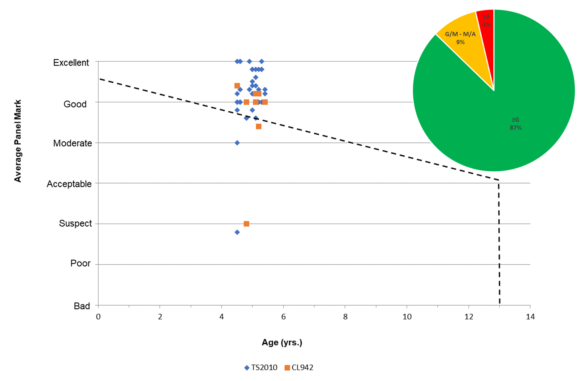
The 2023 survey introduced a step change by surveying sites that were nominally five years old rather than two. The decision was made to assess older sites as recent results had consistently shown that two‑year-old sites were generally defect free. The 2023 results were mainly positive with 87% of the sites showing little or no defect after five years in service. The incidence of joint defects was higher than previous years at 17% but this could be partly explained by the age of the mats. However, 13% of the sites contained other defects or had received remedial work and the likely reasons are discussed under section 4.
Predicting the long-term performance of TS2010
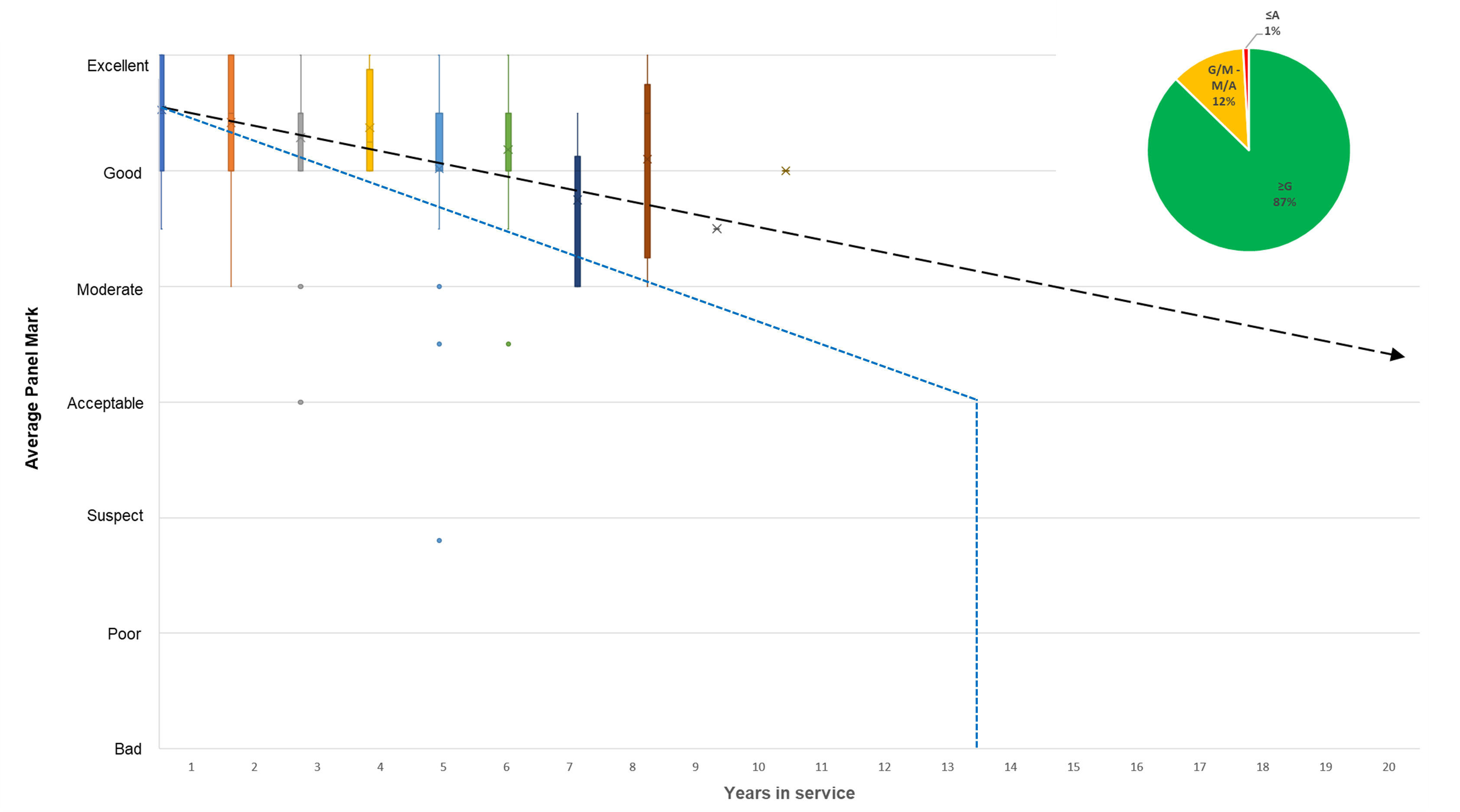
In order to estimate the long-term serviceable life of TS2010, the average visual assessment scores from all SIP surveys conducted on TS2010 have been plotted in Figure 3-2. The figure is based on 220 data points or average scores that have been grouped into years of service. In order to summarise the data, box and whisker plots have been used to show how the data is distributed and also identify statistical outliers. Box and whisker plots, or boxplots, are charts that split data into quartiles. The shape of the boxplot shows how the data is distributed and it also shows any statistical outliers. If the data set has a perfect normal distribution the boxplot will be symmetrical where each whisker will be the same length and represent 25% of the data, and the median will lie in the middle of the box, where each half represents 25%.
It can be seen from some of the boxplots that the annual data is often skewed, e.g. the first couple of boxplots do not contain an upper whisker. This is due to a bias of Excellent/Good scores and in these instances the box represents 75% of the data. As the material ages the distribution becomes more symmetrical. Statistical outliers are defined as data points that are significantly different to the rest of the data. On these boxplots, the standard rule has been used, i.e. Q1-1.5×IQR. It can be seen that data for years 3, 5 and 6 have been identified as containing outliers as they are 1.5 times the interquartile range below the lower quartile.
Figure 3-2 also shows the distribution of the average panel marks over the eleven years of service. The pie chart shows that 87% of the 222 SIP observations were assessed as being Excellent or Good, with 12% Good/Moderate and 1% below Acceptable.
In an attempt to predict the long-term service life of TS2010, a trend line (black dash) has been inserted based on the yearly average result for service years 1 to 9. The properties of the trendline include a correlation coefficient (R2) of 0.76, slope of -0.106 and an intercept with Acceptable at 25 years. It should be noted that the latter value of 25 years is an extrapolated value which is beyond the maximum age of the data collected. It should therefore be treated with caution. It is also generally acknowledged that the final failure mechanism for surface courses is to accelerate exponentially, rather than linearly, as the material reaches a failure condition.
In summary, the annual SIP survey observations of TS2010 suggest a deterioration trend that has greater durability than the trend line (blue dash) reported for TSMA and TAC to reach an Acceptable visual condition. The latter estimate, carried out by the Highways Agency (Nicholls et al., 2010), predicted TAC and TSMA to reach Acceptable after 13 and 14 years, respectively. The trend line for TS2010 estimates the average service life of TS2010 to be around, or in excess of 20 years.
Key
- Blue dashed line - Nicholls et al. (2010)
- Black dashed arrow - TS2010 based on 222 SIP observations